Building a Responsive Layout with Tailwind CSS: Sidebars and Bottom Navigation
Learn to Build Adaptive Layouts for Different Screen Sizes Using Tailwind CSS
👋 Hey there! I'm a passionate developer with a knack for creating robust and user-friendly applications. My expertise spans across various technologies, including TypeScript, JavaScript, SolidJS, React, NextJS.
Introduction
In today’s multi-device world, creating responsive web layouts is essential for delivering a seamless user experience across different screen sizes. A well-designed responsive layout adapts gracefully to various devices, ensuring that content is easily accessible and navigable whether viewed on a desktop, tablet, or smartphone. In this article, we’ll explore how to build a versatile and responsive website layout featuring a left sidebar, a right sidebar for larger screens, and a bottom navigation bar for smaller screens. Using the powerful utility-first CSS framework Tailwind CSS, we’ll simplify the process of crafting a dynamic and adaptive design that enhances usability and aesthetics. Let’s dive in and see how Tailwind CSScan help us achieve a modern, responsive layout effortlessly.
Visual Overview
To help visualize the layout we’ll be building, here are three images showing how it will appear on different screen sizes:
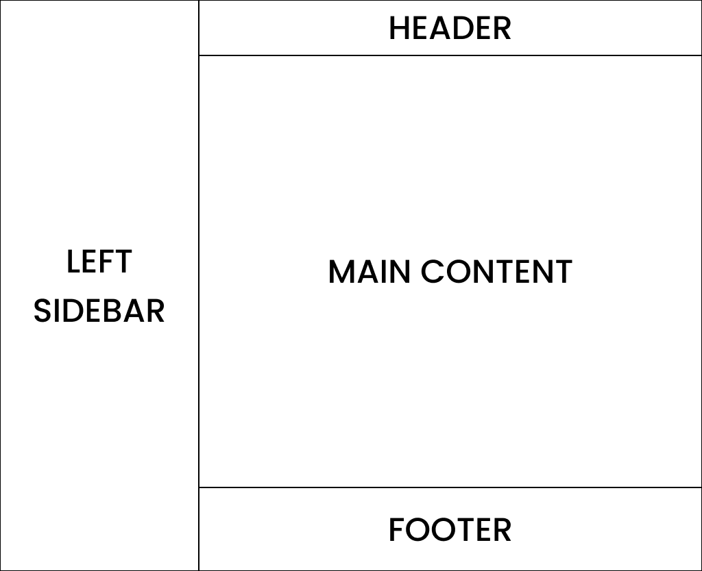
Large Screen Devices

On large screens, the layout includes both the left and right sidebars along with the main content area.
Medium Screen Devices
On medium screens, the layout simplifies to just the left sidebar and the main content area.
Small Screen Devices
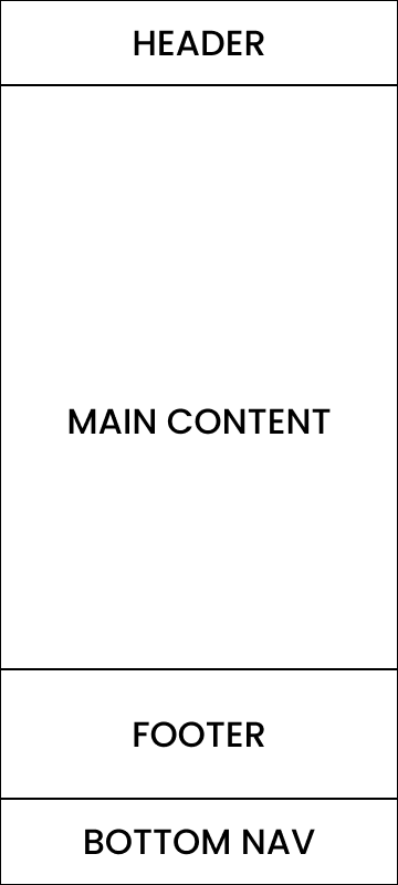
On small screens, the layout transforms to have a bottom navigation bar and the main content area.
The main content area for each layout consists of a header, the main content, and a footer, ensuring a consistent structure across all devices.
Setting Up the Project
To get started, let’s create an empty HTML file and configure Tailwind CSS. Follow these steps:
Step 1: Create an HTML File
First, create an empty HTML file named index.html and open it in your preferred code editor. We’ll use the basic HTML boilerplate to set up our file.
<!DOCTYPE html>
<html lang="en">
  <head>
    <meta charset="UTF-8" />
    <meta name="viewport" content="width=device-width, initial-scale=1.0" />
    <title>Resposive Layout</title>
  </head>
  <body></body>
</html>
Step 2: Configure Tailwind CSS
To configure Tailwind CSS, we’ll use the following steps:
1. Add the Tailwind CSS Script Tag:
Add the following script tag inside the <head> section of your index.html file to include Tailwind CSS from the CDN:
<script src="https://cdn.tailwindcss.com"></script>
2. Test the Tailwind CSS Configuration:
To ensure that Tailwind CSS is working correctly, add the following HTML tag inside the <body> section:
<h1 class="text-3xl font-bold underline">Hello world!</h1>
Your index.html file should now look like this:
<!DOCTYPE html>
<html lang="en">
 <head>
  <meta charset="UTF-8" />
  <meta name="viewport" content="width=device-width, initial-scale=1.0" />
  <script src="https://cdn.tailwindcss.com"></script>
  <title>Resposive Layout</title>
 </head>
 <body>
  <h1 class="text-3xl font-bold underline">Hello world!</h1>
 </body>
</html>
3. Check the Result in the Browser:
Open index.html in your web browser. You should see the text “Hello world!” displayed with bold, underlined, and larger font size, confirming that Tailwind CSS is working correctly.
Now that we have our project set up and Tailwind CSS configured, we can start building our responsive layout.
Creating the HTML Structure
For large screen devices, our layout will include a left sidebar, a main content area with a header and footer, and a right sidebar. We’ll divide the page into three sections and place them side by side using display: flex. Here's how we can achieve this:
Step 1: Create the Main Container
We’ll start by creating a main container that takes up the full width of the page and uses Flexbox for layout.
<div class="w-full flex h-svh max-h-svh">
</div>
w-full: Ensures the container takes up the full width of the viewport.flex: Applies Flexbox layout to the container.h-svh max-h-svh: Ensures the container takes up the full height of the viewport.
Step 2: Add the Left Sidebar
Next, we’ll add a div for the left sidebar inside the main container. This sidebar will take up 30% of the available space.
<div class="w-full flex h-svh max-h-svh">
    <div class="h-full flex-[0.3]">
        <!-- Left Sidebar -->
    </div>
</div>
h-full: Ensures the sidebar takes up the full height of the container.flex-[0.3]: Allocates 30% of the available width to the sidebar.
Step 3: Add the Main Content Area
We’ll add another div for the main content area, which will take up the remaining space.
<div class="w-full flex h-svh max-h-svh">
    <div class="h-full flex-[0.3]">
        <!-- Left Sidebar -->
    </div>

    <div class="h-full flex-1">
        <!-- Main Content Area -->
    </div>
</div>
flex-1: Allocates the remaining space (70%) to the main content area.
Step 4: Add the Right Sidebar
Finally, we’ll add a div for the right sidebar, which will also take up 30% of the available space.
<div class="w-full flex h-svh max-h-svh">
    <div class="h-full flex-[0.3]">
        <!-- Left Sidebar -->
    </div>

    <div class="h-full flex-1">
        <!-- Main Content Area -->
    </div>

    <div class="h-full flex-[0.3]">
        <!-- Right Sidebar -->
    </div>
</div>
flex-[0.3]: Allocates 30% of the available width to the right sidebar.
Adding Contents to Visualize
Let’s integrate the demo content into our large screen layout, including the left sidebar, main content area with header, content, and footer, and the right sidebar.
Step 1: Adding Content to Left Sidebar
First, add the demo content inside the left sidebar:
<div class="w-full flex h-svh max-h-svh">
  <div class="h-full flex-[0.3]">
    <!-- Left Sidebar -->
    <div class="grid h-full place-content-center bg-green-600">
      <h1 class="text-xl">Left</h1>
      <h1 class="text-xl">Sidebar</h1>
    </div>
  </div>

  <div class="h-full flex-1">
    <!-- Main Content -->
  </div>

  <div class="h-full flex-[0.3]">
    <!-- Right Sidebar -->
  </div>
</div>
bg-green-600: Sets the background color of the left sidebar to green.grid place-content-center: Centers the content vertically and horizontally within the sidebar.
Step 2: Adding Content to Left Sidebar
First, add the demo content inside the left sidebar:
<div class="w-full flex h-svh max-h-svh">
  <div class="h-full flex-[0.3]">
    <!-- Left Sidebar -->
    <div class="grid h-full place-content-center bg-green-600">
      <h1 class="text-xl">Left</h1>
      <h1 class="text-xl">Sidebar</h1>
    </div>
  </div>

  <div class="h-full flex-1">
    <!-- Main Content -->
  </div>

  <div class="h-full flex-[0.3]">
    <!-- Right Sidebar -->
    <div class="grid h-full place-content-center bg-blue-600">
      <h1 class="text-xl">Right</h1>
      <h1 class="text-xl">Sidebar</h1>
    </div>
  </div>
</div>
bg-blue-600: Sets the background color of the right sidebar to blue.grid place-content-center: Centers the content vertically and horizontally within the sidebar.
Step 3: Dividing Main Content Area
Next, divide the main content area into sections for header, content, and footer:
<div class="h-full flex-1">
  <!-- Main Content Area-->
  <div class="flex h-full flex-col justify-between overflow-y-scroll">
    <div>
      <!-- Header -->
    </div>

    <div>
      <!-- Content -->
    </div>

    <div>
      <!-- Footer -->
    </div>
  </div>
</div>
flex-col: Arranges the content in a column layout.justify-between: Positions the header and footer at the top and bottom of the main content area, respectively.overflow-y-scroll: Enables vertical scrolling within the main content area if needed.
Now let’s integrate the sticky header, content, and footer into our layout.
Step 1: Adding Sticky Header
Add the sticky header section at the top of the main content area:
<div class="sticky top-0 w-full">
    <!-- Header -->
    <div class="bg-orange-500 py-5">
        <h1 class="text-center text-xl">Header</h1>
    </div>
</div>
sticky top-0: Makes the header sticky at the top of the viewport when scrolling.bg-orange-500: Sets the background color of the header to orange.py-5: Adds padding vertically to the header for spacing.
Step 2: Content and Footer
Ensure the content and footer sections are appropriately placed within the main content area:
<div>
  <!-- Content -->
  <h1 class="text-center text-xl">Content</h1>
</div>

<div class="w-full">
  <!-- Footer -->
  <div class="bg-yellow-600 py-12">
    <h1 class="text-center text-xl">Footer</h1>
  </div>
</div>
Full Main Content Area Code
<div class="h-full flex-1">
  <!-- Main Content Area-->
  <div class="flex h-full flex-col justify-between overflow-y-scroll">
    <div class="sticky top-0 w-full">
      <!-- Header -->
      <div class="bg-orange-500 py-5">
      <h1 class="text-center text-xl">Header</h1>
    </div>
  </div>

  <div>
    <!-- Content -->
    <h1 class="text-center text-xl">Content</h1>
  </div>

  <div class="w-full">
    <!-- Footer -->
    <div class="bg-yellow-600 py-12">
      <h1 class="text-center text-xl">Footer</h1>
    </div>
    </div>
  </div>
</div>
Current Layout Explanation
Till now, our layout includes a left sidebar, a main content area divided into three sections (header, content, and footer), and a right sidebar. Here’s a visual representation and an explanation of what it looks like:
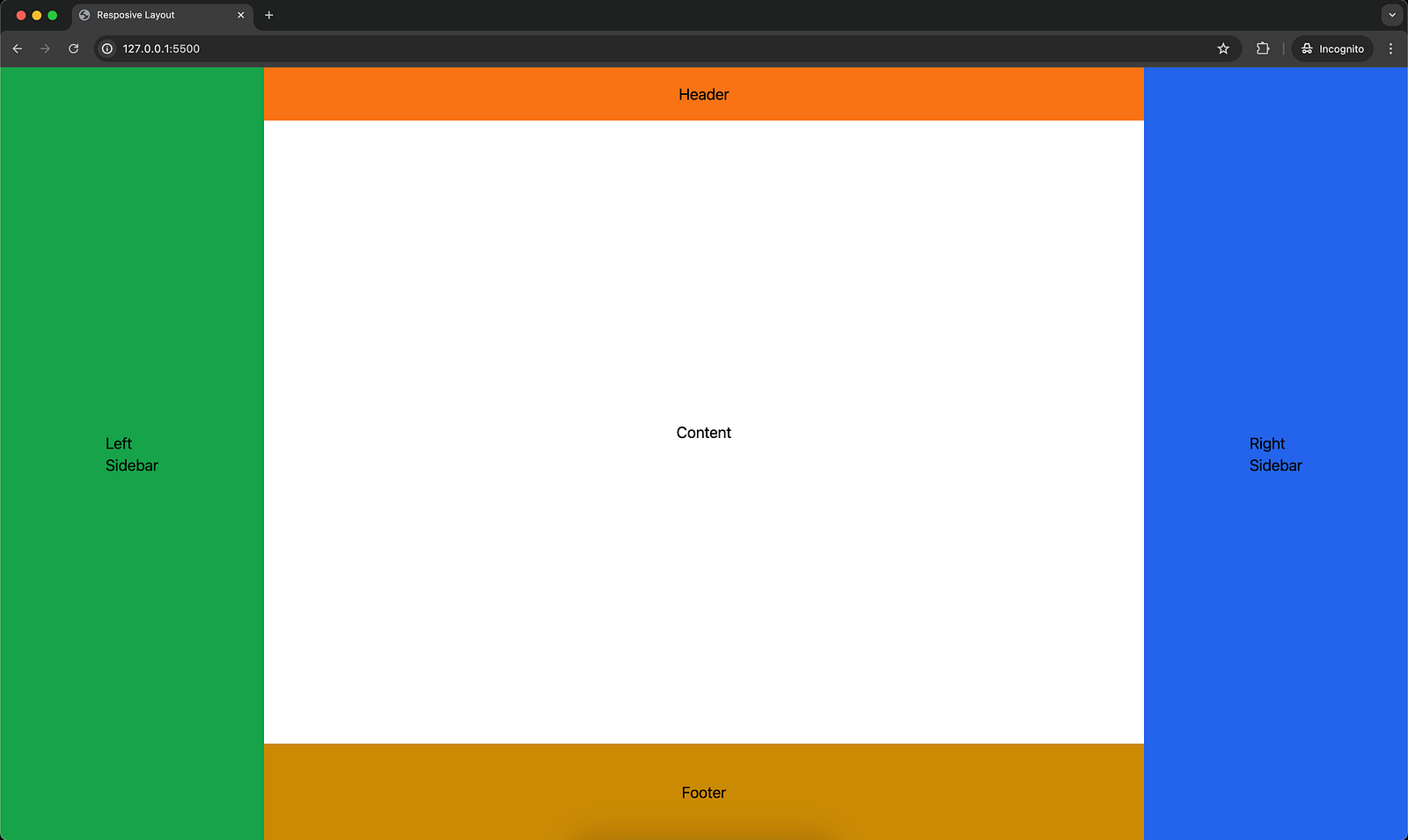
Image Explanation
1. Left Sidebar:
- Appearance: It has a green background with the words “Left” and “Sidebar” centered both vertically and horizontally.
2. Main Content Area:
Header: It has an orange background with the word “Header” centered. It is sticky and remains at the top of the viewport when scrolling.
Content: It has the word “Content” centered within this section.
Footer: It has a yellow background with the word “Footer” centered.
3. Right Sidebar:
- Appearance: It has a blue background with the words “Right” and “Sidebar” centered both vertically and horizontally.
Layout Structure
Flexbox Layout: The overall layout uses Flexbox to arrange the left sidebar, main content area, and right sidebar side by side.
Width Distribution:
Left Sidebar: 30% width of the container.
Main Content Area: 40% width of the container.
Right Sidebar: 30% width of the container.
Height Distribution:
The entire layout takes up the full height of the viewport (
h-svhandmax-h-svh).The main content area is divided vertically into header, content, and footer sections using Flexbox (
flex-colandjustify-between).
Full Code for Reference
<!DOCTYPE html>
<html lang="en">
 <head>
  <meta charset="UTF-8" />
  <meta name="viewport" content="width=device-width, initial-scale=1.0" />
  <script src="https://cdn.tailwindcss.com"></script>
  <title>Resposive Layout</title>
 </head>
 <body>
  <div class="w-full flex h-svh max-h-svh">
   <div class="h-full flex-[0.3]">
    <!-- Left Sidebar -->
    <div class="grid h-full place-content-center bg-green-600">
     <h1 class="text-xl">Left</h1>
     <h1 class="text-xl">Sidebar</h1>
    </div>
   </div>

   <div class="h-full flex-1">
    <!-- Main Content Area-->
    <div class="flex h-full flex-col justify-between overflow-y-scroll">
     <div class="sticky top-0 w-full">
      <!-- Header -->
      <div class="bg-orange-500 py-5">
       <h1 class="text-center text-xl">Header</h1>
      </div>
     </div>

     <div>
      <!-- Content -->
      <h1 class="text-center text-xl">Content</h1>
     </div>

     <div class="w-full">
      <!-- Footer -->
      <div class="bg-yellow-600 py-12">
       <h1 class="text-center text-xl">Footer</h1>
      </div>
     </div>
    </div>
   </div>

   <div class="h-full flex-[0.3]">
    <!-- Right Sidebar -->
    <div class="grid h-full place-content-center bg-blue-600">
     <h1 class="text-xl">Right</h1>
     <h1 class="text-xl">Sidebar</h1>
    </div>
   </div>
  </div>
 </body>
</html>
Making the Layout Responsive
Let’s modify the existing layout to be responsive based on the given requirements:
Left Sidebar: Hidden on small screens and visible on medium screens and above.
Right Sidebar: Hidden on small and medium screens, visible on large screens and above.
Bottom Navigation: Visible on small screens, hidden on medium screens and above.
Here’s the modified code:
Step 1: Updating Left Sidebar
Add hidden md:block to the left sidebar to hide it on small screens and show it on medium and above:
<div class="hidden h-full flex-[0.3] md:block">
  <!-- Left Sidebar -->
  <div class="grid h-full place-content-center bg-green-600">
    <h1 class="text-xl">Left</h1>
    <h1 class="text-xl">Sidebar</h1>
  </div>
</div>
Step 2: Updating Right Sidebar
Add hidden lg:block to the right sidebar to hide it on small and medium screens and show it on large and above:
<div class="hidden h-full flex-[0.3] lg:block">
  <!-- Right Sidebar -->
  <div class="grid h-full place-content-center bg-blue-600">
    <h1 class="text-xl">Right</h1>
    <h1 class="text-xl">Sidebar</h1>
  </div>
</div>
Step 3: Adding Bottom Navigation
Add the bottom navigation inside the main content area, visible on small screens and hidden on medium and above:
<div class="sticky top-0 block bg-pink-500 py-5 md:hidden">
  <h1 class="text-center text-xl">Bottom Navigation</h1>
</div>
Step 4: Modifying Main Content Area
Update the main content area to include the bottom navigation:
<div class="flex h-full flex-1 flex-col">
  <!-- Main Content Area-->
  <div>
    <!-- Header, Content, Footer -->
  </div>

  <div class="sticky top-0 block bg-pink-500 py-5 md:hidden">
    <h1 class="text-center text-xl">Bottom Navigation</h1>
  </div>
</div>
Full Responsive Layout Code
Here’s the complete HTML structure for the responsive layout:
<!DOCTYPE html>
<html lang="en">
 <head>
  <meta charset="UTF-8" />
  <meta name="viewport" content="width=device-width, initial-scale=1.0" />
  <script src="https://cdn.tailwindcss.com"></script>
  <title>Resposive Layout</title>
 </head>
 <body>
  <div class="w-full flex h-svh max-h-svh">
   <div class="hidden h-full flex-[0.3] md:block">
    <!-- Left Sidebar -->
    <div class="grid h-full place-content-center bg-green-600">
     <h1 class="text-xl">Left</h1>
     <h1 class="text-xl">Sidebar</h1>
    </div>
   </div>

   <div class="flex h-full flex-1 flex-col">
    <!-- Main Content Area-->
    <div class="flex h-full flex-col justify-between overflow-y-scroll">
     <div class="sticky top-0 w-full">
      <!-- Header -->
      <div class="bg-orange-500 py-5">
       <h1 class="text-center text-xl">Header</h1>
      </div>
     </div>

     <div>
      <!-- Content -->
      <h1 class="text-center text-xl">Content</h1>
     </div>

     <div class="w-full">
      <!-- Footer -->
      <div class="bg-yellow-600 py-12">
       <h1 class="text-center text-xl">Footer</h1>
      </div>
     </div>
    </div>

    <div class="sticky top-0 block bg-pink-500 py-5 md:hidden">
     <h1 class="text-center text-xl">Bottom Navigation</h1>
    </div>
   </div>

   <div class="hidden h-full flex-[0.3] lg:block">
    <!-- Right Sidebar -->
    <div class="grid h-full place-content-center bg-blue-600">
     <h1 class="text-xl">Right</h1>
     <h1 class="text-xl">Sidebar</h1>
    </div>
   </div>
  </div>
 </body>
</html>
Explanation of Responsive Classes
hidden md:block:
Left Sidebar: Hidden by default (hidden) and displayed as a block (block) on medium screens and above (md).hidden lg:block:
Right Sidebar: Hidden by default (hidden) and displayed as a block (block) on large screens and above (lg).block md:hidden:
Bottom Navigation: Displayed as a block (block) by default and hidden (hidden) on medium screens and above (md).
This setup ensures the layout adapts seamlessly to different screen sizes, providing a user-friendly experience across devices.
Visual Representation:
Medium Screen Layout
On medium screens, the layout includes the left sidebar and the main content area, but the right sidebar is hidden.
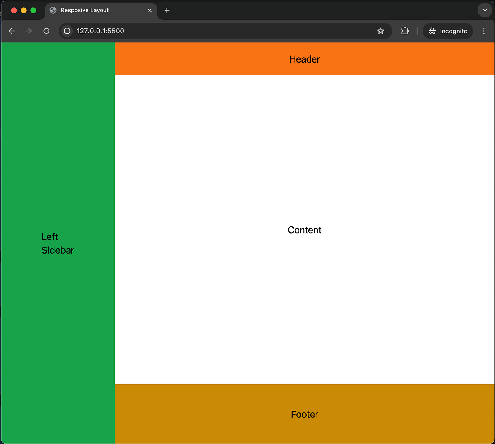
Explanation:
Left Sidebar: Visible with the same green background as on large screens, taking up 30% of the width.
Main Content Area: Takes up the remaining width (70%) and includes the header, content, and footer sections.
Right Sidebar: Hidden (
hidden lg:block).
Small Screen Layout
On small screens, the layout includes only the main content area and a bottom navigation bar, while both sidebars are hidden.
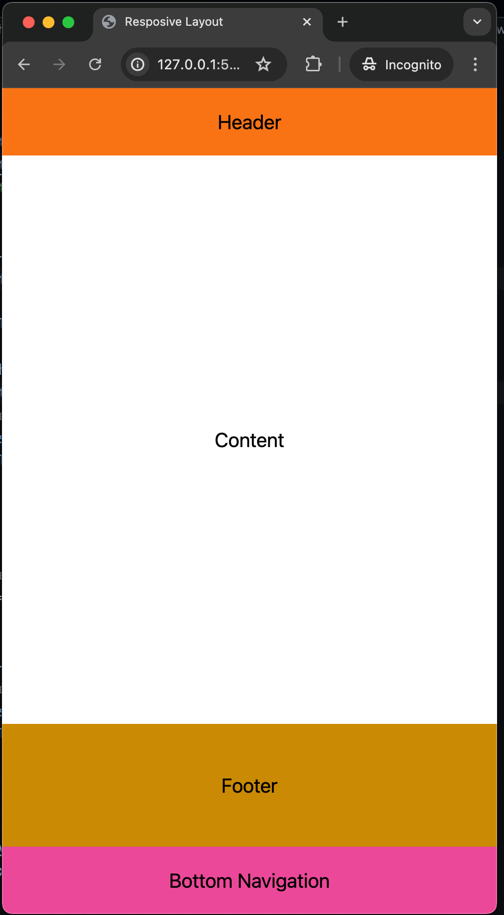
Explanation:
Left Sidebar: Hidden (
hidden md:block).Main Content Area: Takes up the full width and includes the header, content, and footer sections.
Bottom Navigation: Visible at the bottom, with a pink background, displayed using
block md:hidden.
Responsive Behavior Summary Table
Here’s a table summarizing the responsive behavior for different screen sizes:
| Component | Small Screens (<768px) | Medium Screens (>=768px) | Large Screens (>=1024px) |
| Left Sidebar | Hidden | Visible | Visible |
| Main Content | Visible | Visible | Visible |
| Right Sidebar | Hidden | Hidden | Visible |
| Bottom Navigation | Visible | Hidden | Hidden |
This table provides a clear and concise summary of how each component behaves across different screen sizes, ensuring that the layout adapts effectively to provide an optimal user experience on all devices.
Conclusion
In this guide, we’ve walked through the process of creating a responsive layout for a website using Tailwind CSS. Our goal was to build a layout that adapts to different screen sizes, ensuring a seamless user experience across all devices. Here’s a quick recap of what we’ve accomplished:
1. Initial Setup:
Created an empty HTML file and included the Tailwind CSS script.
Verified the Tailwind CSS setup with a test element.
2. Building the Layout:
Divided the page into three sections: a left sidebar, a main content area (with header, content, and footer), and a right sidebar.
Used Flexbox to arrange these sections side by side.
3. Adding Demo Content:
- Populated the left and right sidebars, as well as the main content area, with sample content to visualize the layout.
4. Making the Layout Responsive:
Utilized Tailwind CSS utility classes to hide or show elements based on the screen size:
Left Sidebar: Hidden on small screens, visible on medium and large screens.
Right Sidebar: Hidden on small and medium screens, visible on large screens.
Bottom Navigation: Visible on small screens, hidden on medium and large screens.
Ensured the main content area remained visible on all screen sizes.
5. Responsive Behavior Summary:
- Provided a table summarizing the behavior of each component across different screen sizes.
By following these steps, you can create a versatile and user-friendly layout that caters to various devices, from large desktop monitors to small mobile screens. Tailwind CSS simplifies the process, allowing you to focus on designing and building a responsive layout without getting bogged down in complex CSS. This approach not only enhances the visual appeal of your website but also improves accessibility and usability for all users.
Happy Coding!